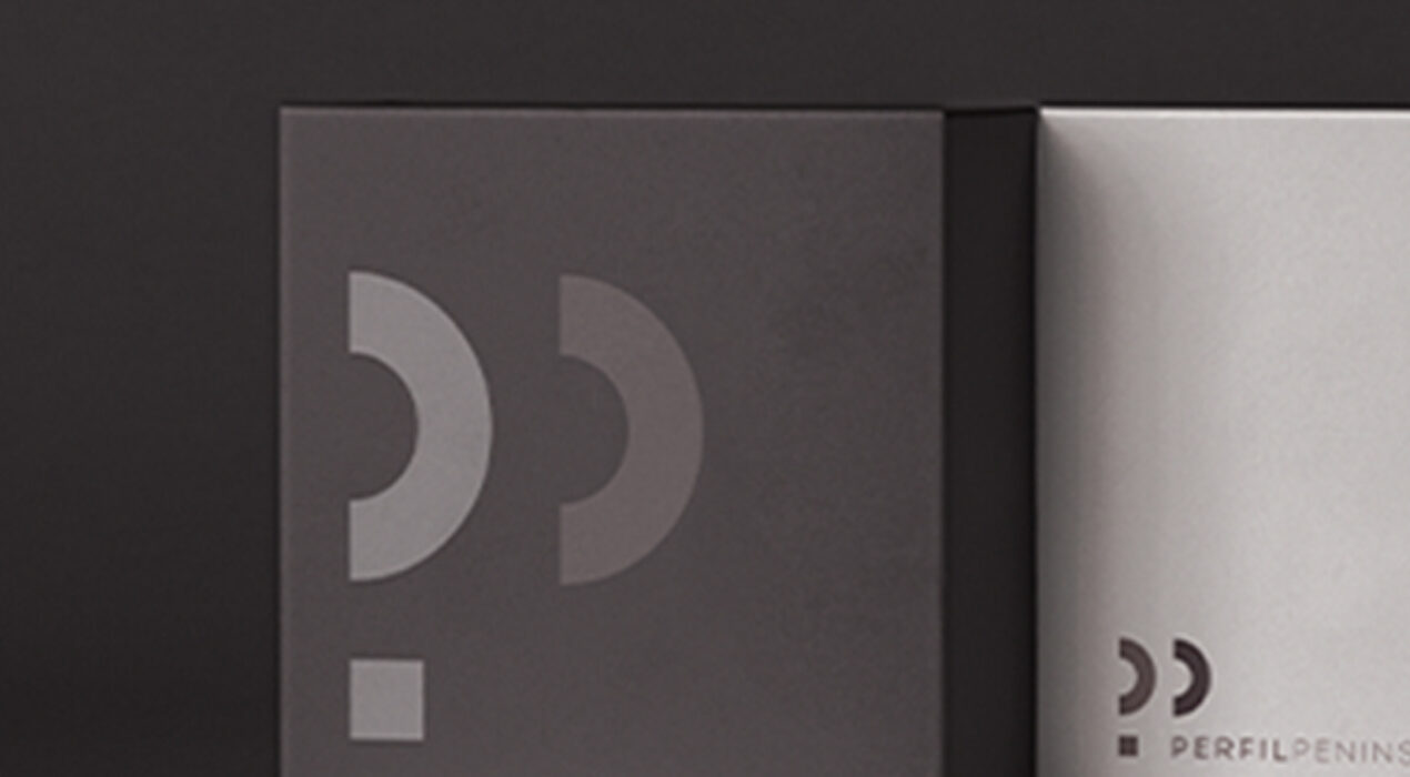
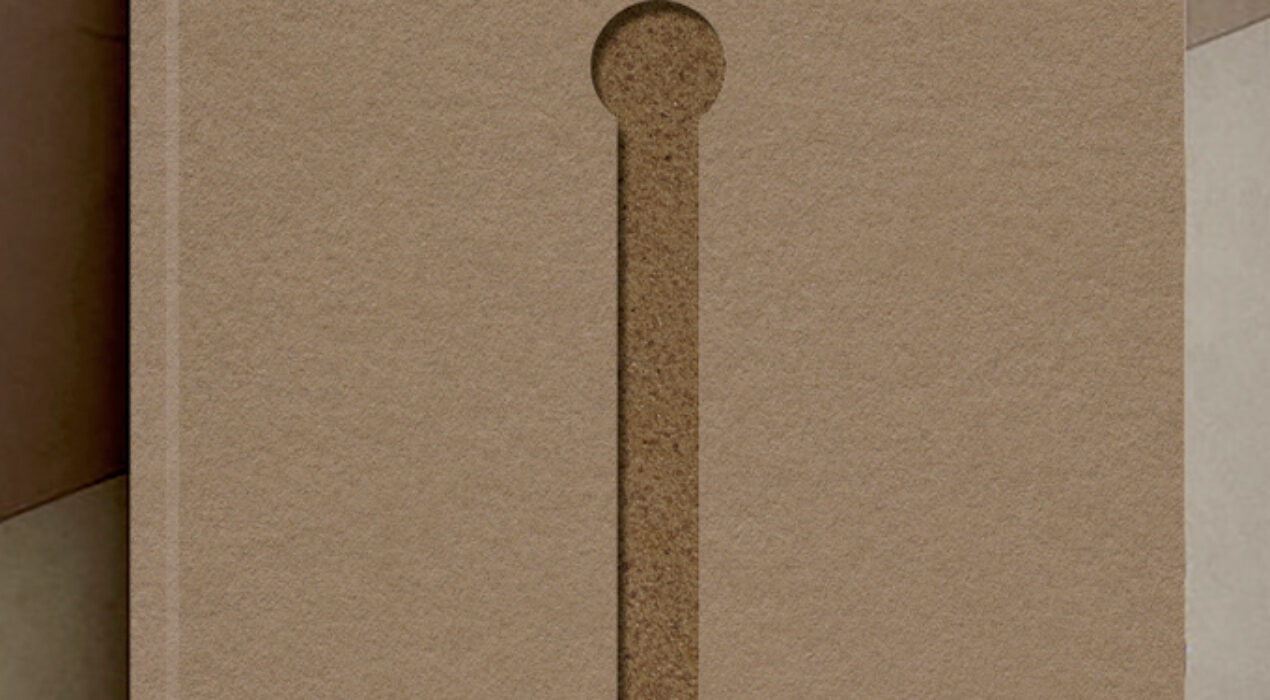
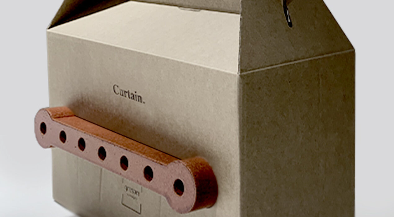
PERFIL PENINSULAR is currently among the main suppliers of hotel furniture nationwide, betting every day on the high quality of its products, the comfort and longevity of its models, the best customer service, and the guarantee of extensive experience, with 40 years of experience in the sector. Its facilities, with a permanent stock of all its products, support the purpose of the company to respond quickly to the demand of its customers. The objective of the restyling in the corporate visual identity of the brand is to bring together and value all those characteristic features that define it, adapting the brand to the current social context and creating an aesthetic environment based on elegance, minimalism and timelessness. client: Perfil Peninsularcategory: Brand Identity
Read More ›
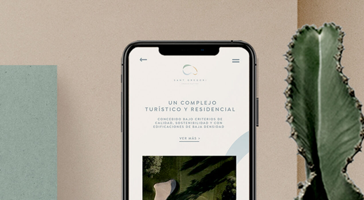
To create the new brand that will represent the values of the urban area of the Sant Gregori project, we have been inspired by the very organic shapes that nature itself possesses and its colors, which will serve as the basis for transferring all those brand values that we want to transmit. These forms will work intertwining with each other, creating a powerful and evocative visual structure symbol of the perfect balance between land, sea and air. Said symbol will serve to differentiate the brand from the competition, generating an icon that will reflect warmth, modernity, prestige and nature. The colors used (blue, green and orange) remind us of the sea, the earth and its natural wealth and the surrounding natural landscapes. In short, it is possible to create a new brand with solid brand values, an aspirational, modern and fresh visual image, up to the expectations of the project. client: Sant Gregoricategory: Brand Identity
Read More ›
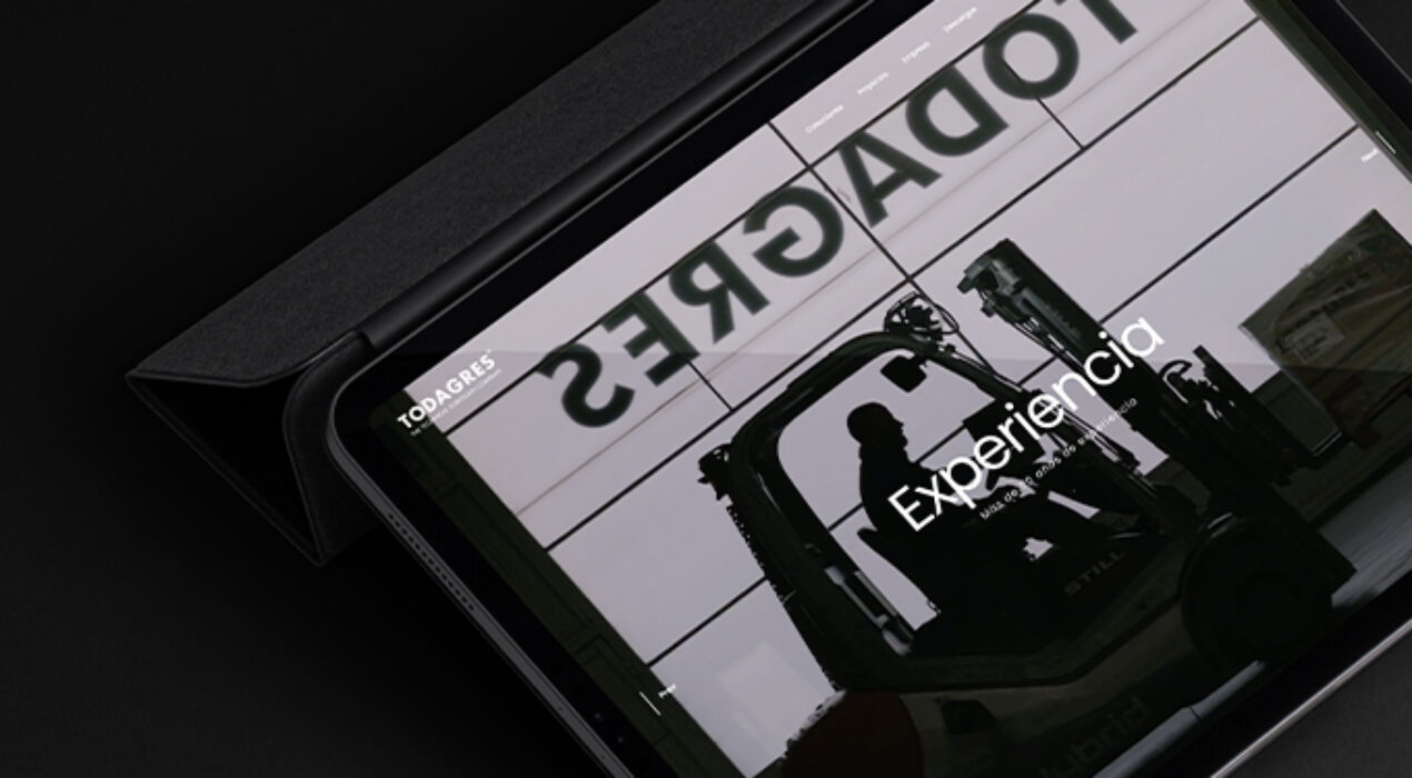
Todagres needed to update its digital environment, create a new online platform that would visualize its materials in a more intuitive and interactive way. A new website in which image and movement take center stage, generating a new, more dynamic environment that is pleasant to the user and much more visually attractive. client: Todagrescategory: Web Design
Read More ›
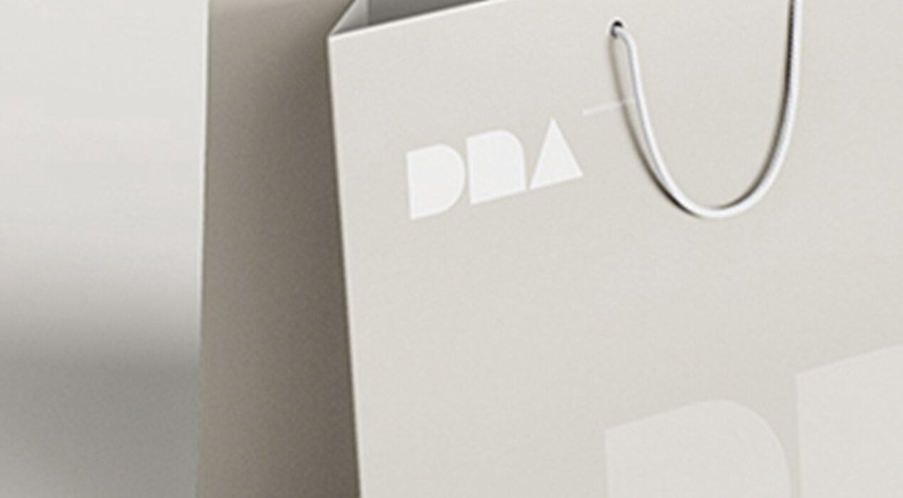
To develop the logo design proposal we have based ourselves on the following concepts: The origin of the brand and its relationship with the other firms in the group: We will use the WOW logo to establish it as a grid that would define the limits of the new brand. The formal relationship established between the brand and the product it represents: The structure of the new brand suggests geometries inspired by ceramic tiles that at the same time will serve to outline the DNA brand. The message that it is capable of transmitting: From the grid we obtain a very geometric font which gives us the sensation of typography "to finish sculpting", which is ultimately what DNA does: create a virgin product that the client will have to finish defining. client: DNA Tilescategory: Brand Identity
Read More ›
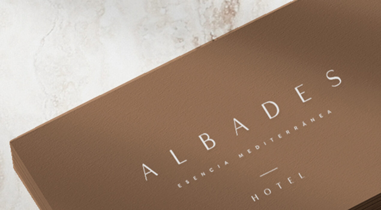
We are looking for a unique brand, with a Mediterranean character and local flair. A brand that projects personality, sophistication and a carved personality, reflecting a philosophy of life closely linked to the maritime environment and Mediterranean culture. To do this, we will use a name with a short structure, memorable and forceful that at the same time emanates character and distinction, capable of transmitting all the brand values that we want to reflect. This is how Hotel Albades was born, a place that brings together the essence of the Mediterranean Sea, a symbol of quality, well-being and relaxation, under a recognizable and poetic pretext linked to the intrinsic roots of the area. client: Hotel Albadescategory: Brand Identity
Read More ›
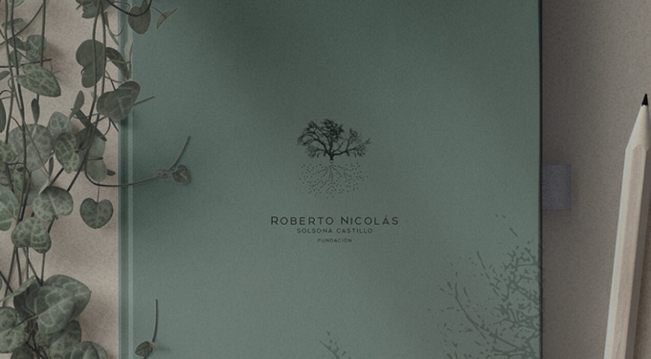
Since the beginning of life, human beings have lived surrounded by nature, that wise entity that for so many centuries has endowed us with all the mechanisms and impulses destined for our own survival and happiness. What has generated a neurobiological connection of the human being with it. A special bond that has existed and exists in all cultures on the planet, because the human being cannot survive without that constant relationship with the environment. But the evolution of our species today has caused society to distance itself from this feel natural, so that these ties that unite us are getting further and further away due to our way of life in large cities with high degrees of pollution and low rhythm of frenetic life, which has had a negative impact on our own species. From this innate link with the environment, Innate was born, a creative concept that focuses on reconnecting with nature, with what is truly important, innate and authentic. At the Roberto Nicolás Solsona Castillo Foundation, we work to value the natural environment that surrounds us, awakening the awareness of society to join forces in its protection and care. We want to make people feel the importance […]
Read More ›
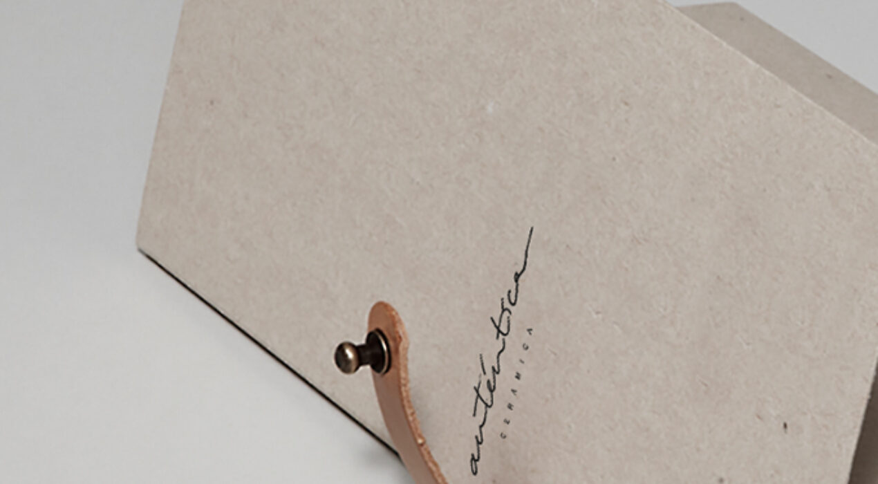
For the elaboration of said identity, we have been inspired by the authentic traditional values, capable of differentiating themselves from the rest in a society so automated and connected to technology. A return to the origins that was increasingly demanded by a social movement towards a slower pace of life, valuing dedication and passion in the creation of each of the brand's ceramic pieces. And giving great added value to the creation of these unique and singular pieces. Authentic comes from the Greek, Authentikos, whose meaning translates into something unique, original and differentiating. Values that we associate with the product that Auténtica Cerámica manufactures: pieces with an artisan spirit, unique character and timeless essence. client: Auténtica Cerámicacategory: Brand Identity
Read More ›
This mode enables people with epilepsy to use the website safely by eliminating the risk of seizures that result from flashing or blinking animations and risky color combinations.
Visually Impaired Mode
Improves website's visuals
This mode adjusts the website for the convenience of users with visual impairments such as Degrading Eyesight, Tunnel Vision, Cataract, Glaucoma, and others.
Cognitive Disability Mode
Helps to focus on specific content
This mode provides different assistive options to help users with cognitive impairments such as Dyslexia, Autism, CVA, and others, to focus on the essential elements of the website more easily.
ADHD Friendly Mode
Reduces distractions and improve focus
This mode helps users with ADHD and Neurodevelopmental disorders to read, browse, and focus on the main website elements more easily while significantly reducing distractions.
Blindness Mode
Allows using the site with your screen-reader
This mode configures the website to be compatible with screen-readers such as JAWS, NVDA, VoiceOver, and TalkBack. A screen-reader is software for blind users that is installed on a computer and smartphone, and websites must be compatible with it.
Online Dictionary
Readable Experience
Content Scaling
Default
Text Magnifier
Readable Font
Dyslexia Friendly
Highlight Titles
Highlight Links
Font Sizing
Default
Line Height
Default
Letter Spacing
Default
Left Aligned
Center Aligned
Right Aligned
Visually Pleasing Experience
Dark Contrast
Light Contrast
Monochrome
High Contrast
High Saturation
Low Saturation
Adjust Text Colors
Adjust Title Colors
Adjust Background Colors
Easy Orientation
Mute Sounds
Hide Images
Virtual Keyboard
Reading Guide
Stop Animations
Reading Mask
Highlight Hover
Highlight Focus
Big Dark Cursor
Big Light Cursor
Navigation Keys
DECLARACIÓN DE ACCESIBILIDAD
SUMMUMSTUDIO se ha comprometido a hacer accesibles sus sitios web de conformidad con el Real Decreto 1112/2018, de 7 de septiembre, sobre accesibilidad de los sitios web y aplicaciones para dispositivos móviles del sector público (en adelante, Real Decreto 1112/2018, de 7 de septiembre).
La presente declaración de accesibilidad se aplica al sitio web https://www.summumstudio.es
SITUACIÓN DE CUMPLIMIENTO
Este sitio web es parcialmente conforme con el Real Decreto 1112/2018, de 7 de septiembre, debido a la falta de conformidad de los aspectos que se indican a continuación.
CONTENIDO NO ACCESIBLE
El contenido que se recoge a continuación no es accesible por lo siguiente:
Falta de conformidad con el Real Decreto 1112/2018, de 7 de septiembre: podrían existir fallos puntuales de edición en alguna página web, tanto en contenidos HTML como en documentos finales, publicados en fecha posterior al 20 de septiembre de 2018 (fecha de entrada en vigor del Real Decreto 1112/2018, de 7 de septiembre).
Carga desproporcionada: no aplica.
PREPARACIÓN DE LA PRESENTE DECLARACIÓN DE ACCESIBILIDAD
La presente declaración fue preparada el 25 de abril de 2023.
El método empleado para preparar la declaración ha sido una autoevaluación llevada a cabo por el propio organismo.
OBSERVACIONES Y DATOS DE CONTACTO
Puede realizar comunicaciones sobre requisitos de accesibilidad (artículo 10.2.a) del Real Decreto 1112/2018, de 7 de septiembre) como, por ejemplo:
Informar sobre cualquier posible incumplimiento por parte de este sitio web. Transmitir otras dificultades de acceso al contenido. Formular cualquier otra consulta o sugerencia de mejora relativa a la accesibilidad del sitio web.
A través de este procedimiento podrá iniciar una reclamación para conocer y oponerse a los motivos de la desestimación de una solicitud de información accesible o queja, instar la adopción de las medidas oportunas en el caso de no estar de acuerdo con la decisión adoptada, o exponer las razones por las que se considera que la respuesta no cumple con los requisitos exigidos.
CONTENIDO OPCIONAL
La versión actualmente visible de este sitio web es de febrero de 2023 y en esa fecha se hizo la revisión del nivel de accesibilidad vigente en aquel momento. Entre otras se adoptan las siguientes medidas para facilitar la accesibilidad:
Utilización de texto alternativo en las imágenes. Los enlaces ofrecen detalles de la función o destino del hipervínculo. Uso de los estándares del W3C: XHTML 1.0, CSS 3.0, WAI AA.
Puede consultar en la página de Aviso Legal para qué navegadores y versiones está optimizado este sitio web.