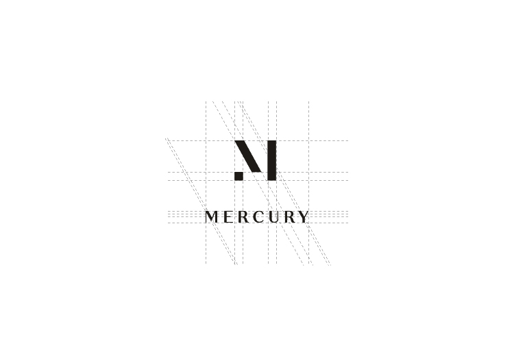
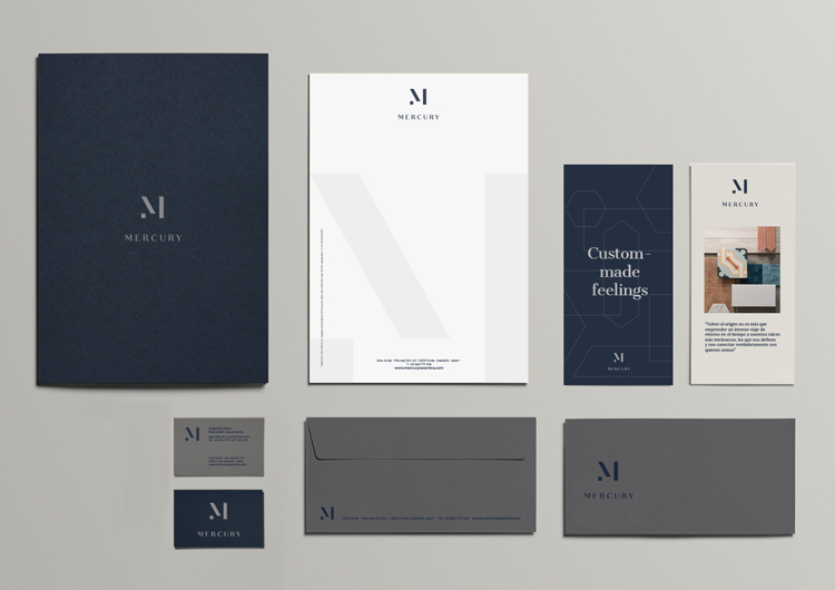
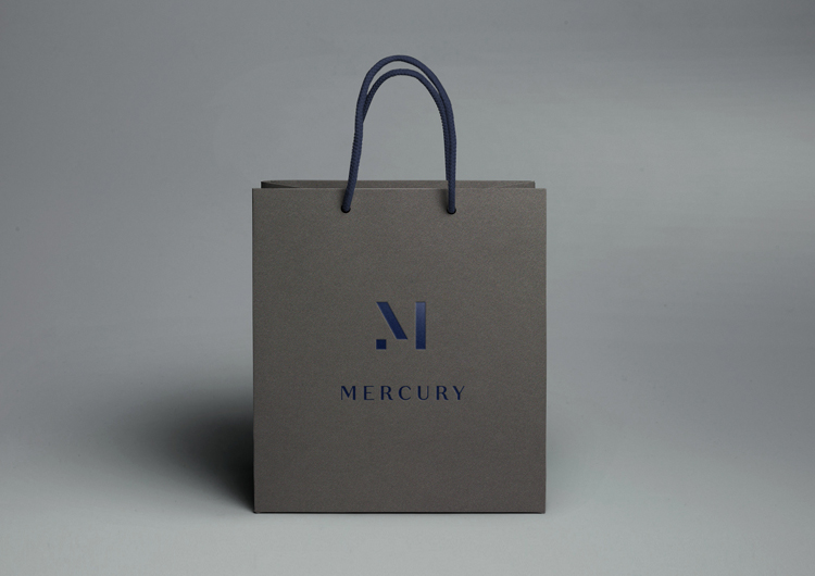
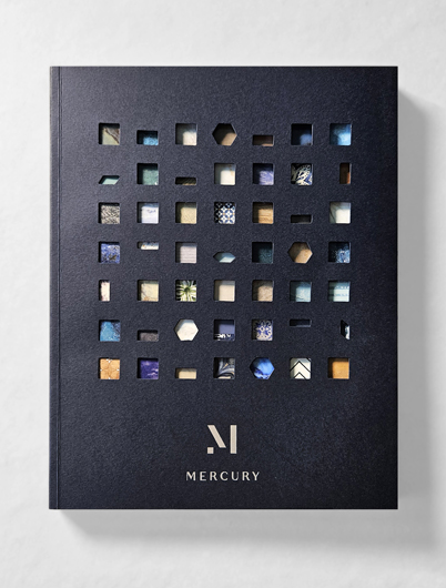
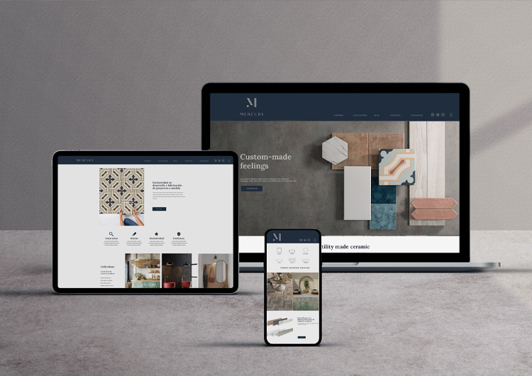
The new image of MERCURY Cerámica has an evocative and sophisticated character. It is built through the identity of its own materials creating geometric shapes that remind us of its products an anagram whose geometry transports us to a pure and minimalist logo that will guarantee its timelessness and sobriety.
Accompanying the anagram that symbolises the M of Mercury we find a typography full of character and personality whose classic morphology and elegant countenance contrasts with the purer geometric symbols of the isotype creating a complete brand whose visual balance lies in the reflection of its more traditional and classic origins with a modern and minimalist appearance at the same time.

client: Mercury Cerámica
category: Global brand identity
awarded project: Anuaria Selection Best Corporate Identity Program & Catalogue Design for Mercury Cerámica