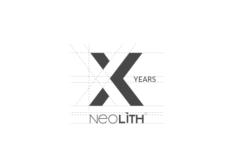
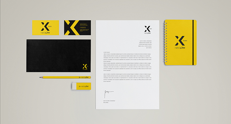
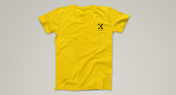
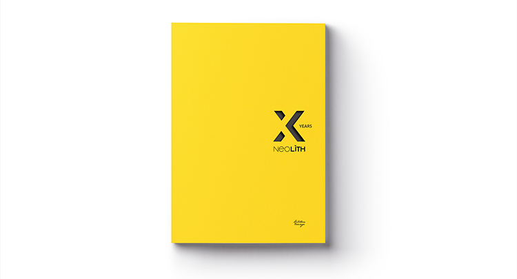
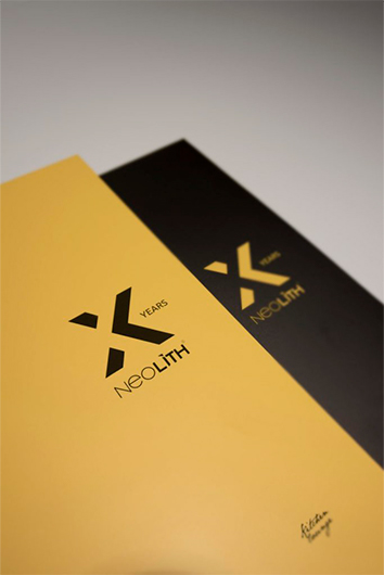
For the tenth anniversary of Neolith we have created a logo that represents the strength of the brand in the market. To do this, and using the "X" as the main element of the logo, through a game of shadows and empty spaces we generate a very powerful visual effect that highlights it even more. In this way, we obtain an organic, modern and current logo, with balanced geometric shapes very much in line with the visual style of the Neolith brand. In its structure, the logo will always coexist accompanied by the word "years" and the Neolith logo, both in its vertical and horizontal application.
client: Neolith
category: Brand Identity
