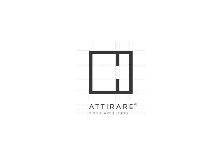
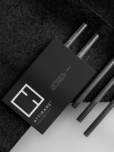
Minimalist corporate identity based on simplicity and functionality, focusing on the essential and eliminating any superfluous elements. This approach can be very effective in communicating clarity, modernity and sophistication.
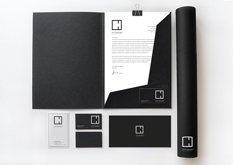
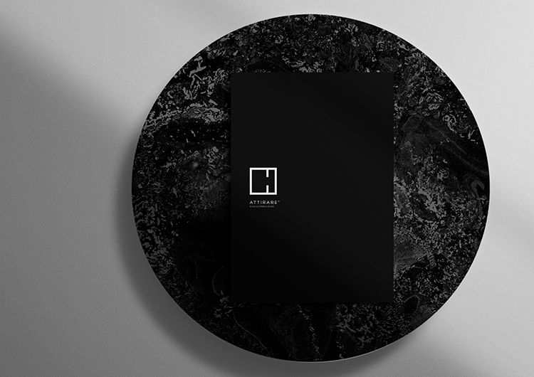
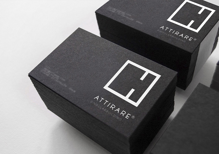
This design is a statement of the values and image that the company wishes to project. This color combination conveys professionalism, confidence, durability and seriousness.
Clean lines and geometric shapes have been used for the logo that reinforce the idea of structure and solidity.
By focusing on the essentials and eliminating visual clutter, a brand can stand out and be easily recognizable. The key to minimalism is simplicity and coherence, ensuring that each design element contributes to a cohesive and professional image.
client: Attirare
category: Brand Identity