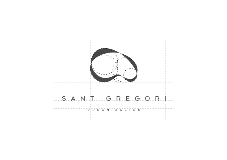
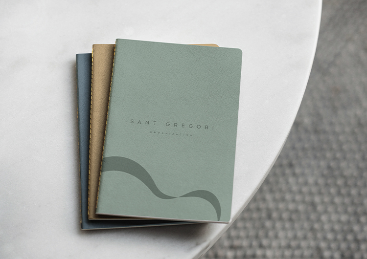
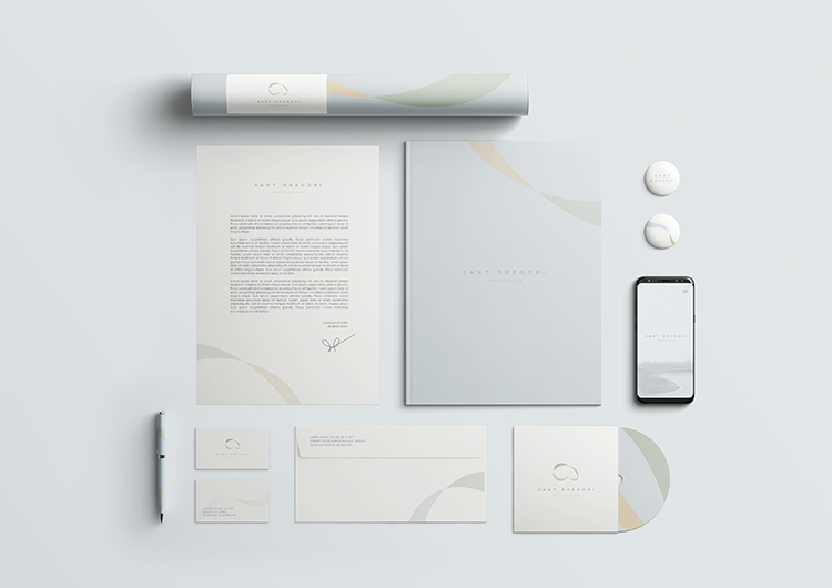
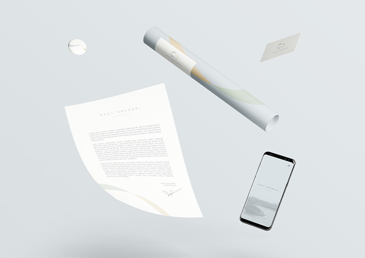
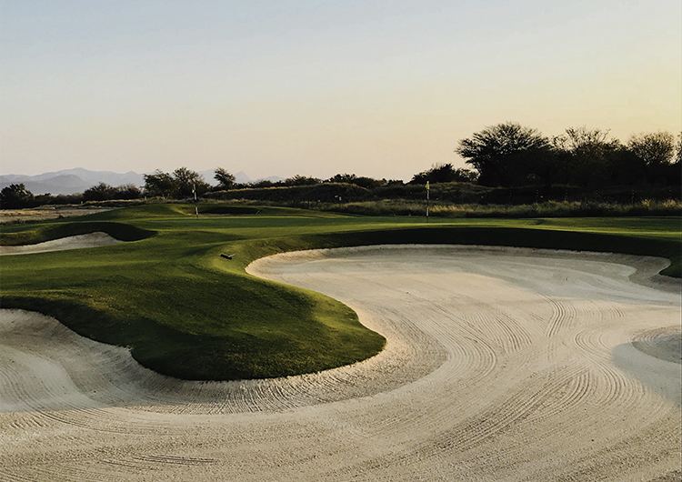
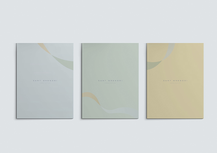
To create the new brand that will represent the values of the urban area of the Sant Gregori project, we have been inspired by the very organic shapes that nature itself possesses and its colors, which will serve as the basis for transferring all those brand values that we want to transmit.
These forms will work intertwining with each other, creating a powerful and evocative visual structure symbol of the perfect balance between land, sea and air. Said symbol will serve to differentiate the brand from the competition, generating an icon that will reflect warmth, modernity, prestige and nature.
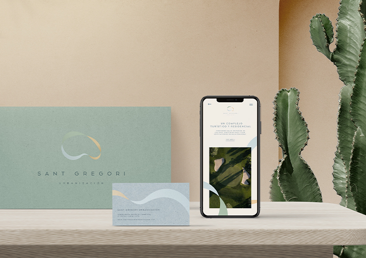
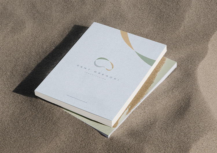
The colors used (blue, green and orange) remind us of the sea, the earth and its natural wealth and the surrounding natural landscapes. In short, it is possible to create a new brand with solid brand values, an aspirational, modern and fresh visual image, up to the expectations of the project.
client: Sant Gregori
category: Brand Identity