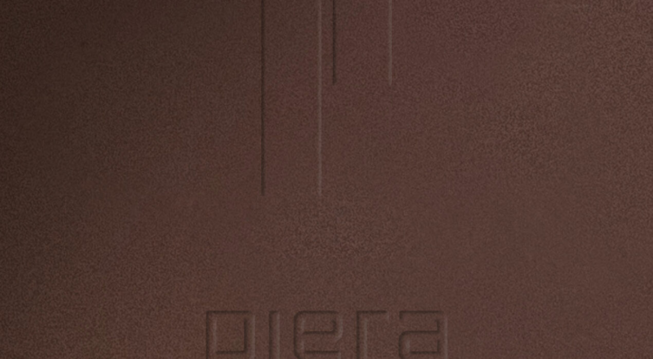
Piera's new identity is born from a renewed and sophisticated vision that aims to convey the constructive and architectural character of its products through a professional approach adapted to new times. This graphic identity, although completely updated, is able to preserve the essence that truly defines Piera, creating a harmonious transition that respects its heritage, maintaining its roots and adding an extra touch of freshness and character.The objective is to develop a brand that evokes, through a minimalist design and architectural character, the same values by which the brand is identified, adding a bonus of quality, professionalism and personality.In this renewed identity, we seek for Piera Ecoceramica to project a relevant image that inspires confidence and professionalism and reflects its unwavering commitment to quality and respect for the environment.An identity through which the architectural character of the brand is transmitted, providing a more careful and professional aesthetic, which transmits the values of the brand and the idea of offering architects and interior designers inspiration and personalization of products that fit the vision of their projects. client: Piera Ecocerámicacategory: Brand Identity
Read More ›
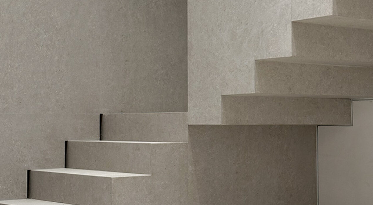
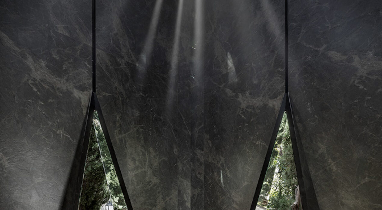
Casa RG is an interior architecture project developed within a detached single-family home located in a residential area of Ciudad Campo, Madrid. This commission represented a complex challenge, as we started with an existing building featuring an unchangeable, pre-defined layout. Our task was to undertake a meticulous, almost surgical approach to implement minimal improvements that would achieve the most efficient and aesthetically impactful results. The project required a careful selection of materials to provide the pre-existing structure with formal, architectural, and material coherence. Our goal was to transform the spaces by bringing in light, harmony, balance, and sobriety. Once the "container" — the resulting architectural shell — was consolidated, we began creating strategic volumes that added functionality and continuity to the interior spaces, thus achieving a fluid architectural narrative. The greatest challenge lay in working within the constraints of an already-built structure. In projects like this, where the walls are already in place, the level of difficulty increases significantly. Our proposal had to fit precisely into the existing structure, making it appear as though every decision was part of the original design. This approach led us to design architectural elements that introduced movement, fluidity, and dynamism to the space without […]
Read More ›
After a deep process of reflection, the brand takes a leap toward a more human, more sensorial essence, closer to the user. Because design is not just a matter of aesthetics, but of experiences, moments, and emotions that transform the everyday into the extraordinary.At Summumstudio, we have accompanied Profiltek on this journey of rediscovery, building an identity that exudes calm, emotion, and well-being. An identity where forms dialogue with sensitivity, where materials come alive, and the design becomes a reflection of its comfortable and accessible nature.This paradigm shift for the brand becomes an invitation to experience the bathroom through sensory experiences. To experience space in a more intuitive way, to connect with the essence of every detail. Profiltek not only designs, but also excites.client: Profiltekcategory: Corporate Visual Identity
Read More ›
This is how 'Core, heart of the earth', Grespania's new creative, was bornconcept.An ode to nature and the four elements that make it up: earth, fire, water.and air. A great heart of stone capable of housing all the beauty in itselfand emotion of each and every one of its collections.A concept that also symbolizes the return of the brand to its origin, to the placewhere the true essence of the raw material is found.A space converted into a metaphor, which functions as a parallel to our greatvital organ. The engine that makes everything work and make sense.Achieve that both worlds, tangible and intangible, matter and emotion,They come together under the same space, creating an immersive experience,where beauty, design and purity emerge in their purest and most natural stateway to highlight the true essence of the brand client: Grespaniacategory: Ephemeralawarded project: Emporia Selection 2024
Read More ›
With this strategic change in positioning, the Fanal brand is redirected towards new territories that will provide a high degree of added value, both to the brand itself and to its materials and technologies. A change in visual identity that entails an entire strategic and commercial plan that aims to give the firm a qualitative leap in the search for a renewed value proposition that guides the new brand towards the world of technology, design and architectural innovation. A firm commitment that aims to transform the brand from the inside, marking a new horizon that looks towards the future. client: Fanal Cerámica category: Brand Identityawarded project: Anuaria Selection Best Flyer/Postcard Design 2024
Read More ›
The brand is deeply connected to outdoor living and Mediterranean culture, a relationship that is accentuated by the popularity of its pool solutions and versatile outdoor tiles.The exhibition space consists of a 105m² rectangle with its main side facing the courtyard between pavilions 25 and 26. This prime location offers a blank canvas with abundant natural light, providing an ideal setting to highlight the brand's outdoor-focused identity.The primary challenge is to creatively present the diverse range of products while ensuring a cohesive and visually striking space. Our aim was to pursue an architectural concept that stands out through originality and disruption, capturing the attention of potential clients who view design as a tool for differentiation and added value.This new location presents a unique opportunity to showcase EXAGRES' products in an environment that feels as close to the outdoors as possible, with natural light playing a key role in shaping the atmosphere of the space. Mediterranean architecture has long relied on the control of sunlight to generate and sculpt forms. Building on this principle, we designed an envelope that defines the booth's façade, utilizing a ceramic "skin" that functions like a curtain. This innovative surface filters sunlight and casts dynamic shadows, […]
Read More ›
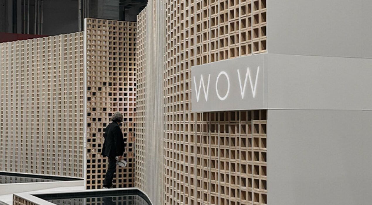
Blue Mediterranean experience is the new concept developed by WOW presented at Cersaie 2024. A proposal inspired by the architecture of coral reefs and the incidence of light underwater through these structures. Showing a melting pot of materialities of great chromatic richness.The main facade plane evokes a coral structure that “suffers the impact of a wave”, sculpting its shape and leaving a mark that will give rise to the reception space where we find its only access. This large lattice will filter the outside light, playing with it and projecting it inward. Protecting a second skin in which we can discover a multitude of colored textures that evoke the seabed, where the product will be displayed in layers and in a stratified manner, to later access different rooms of a conceptual and inspiring character.The distribution proposal is ordered from least to greatest privacy, presenting in a foreground the areas with the greatest influx of public and where we have managed to define a circular route, to separate the areas of greatest privacy, arranged in the back which will be used for personalized commercial attention. With the aim of obtaining an experiential installation of ephemeral architecture of an immersive nature. client: […]
Read More ›
The minimalist design of this single-family home focuses on simplicity, visual cleanliness and functional efficiency. This modern architectural approach not only seeks to create aesthetically pleasing spaces, but also optimize functionality and promote a comfortable and hassle-free lifestyle.Natural and high-quality materials have been used, such as polished concrete, light wood and steel. These materials add texture and warmth to the space, require minimal maintenance, and have a long lifespan. The finishes are simple and elegant, avoiding unnecessary ornaments or complicated details that could distract from the clean and orderly design. client: MJMcategory: Residencial
Read More ›
Unique visual and tactile experience that highlights the beauty and versatility of natural stone and ceramics. Neutral tones create an elegant and sober atmosphere, allowing the products on display to be the protagonists. The entrance to the stand is spacious and welcoming, with an arch of stone that gives a feeling of robustness and permanence. client: Perondacategory: Ephemeralawarded project: Coverings Best in Show 2024
Read More ›
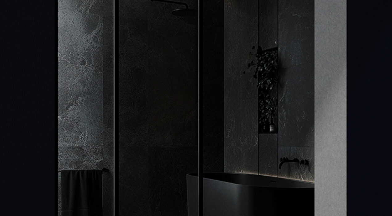
SMMS® designs an inspirational space for Neolith in which its product blends with the environment, creating an invisible forest of veins, in which light and water evoke the passage of time. An ode to nature as a permanent source of inspiration, reinforcing the commitment and respect that the brand maintains for the environment. client: Neolithcategory: Exhibitionphotography: Nacho Uribe Salazar, Summumstudio y Bacon Studioawarded project: Casadecor 2024 First Mentionawarded project: Emporia Gold 2024 Miscellanyawarded project: Surface Design Awards 2025 - light & Surface
Read More ›
This mode enables people with epilepsy to use the website safely by eliminating the risk of seizures that result from flashing or blinking animations and risky color combinations.
Visually Impaired Mode
Improves website's visuals
This mode adjusts the website for the convenience of users with visual impairments such as Degrading Eyesight, Tunnel Vision, Cataract, Glaucoma, and others.
Cognitive Disability Mode
Helps to focus on specific content
This mode provides different assistive options to help users with cognitive impairments such as Dyslexia, Autism, CVA, and others, to focus on the essential elements of the website more easily.
ADHD Friendly Mode
Reduces distractions and improve focus
This mode helps users with ADHD and Neurodevelopmental disorders to read, browse, and focus on the main website elements more easily while significantly reducing distractions.
Blindness Mode
Allows using the site with your screen-reader
This mode configures the website to be compatible with screen-readers such as JAWS, NVDA, VoiceOver, and TalkBack. A screen-reader is software for blind users that is installed on a computer and smartphone, and websites must be compatible with it.
Online Dictionary
Readable Experience
Content Scaling
Default
Text Magnifier
Readable Font
Dyslexia Friendly
Highlight Titles
Highlight Links
Font Sizing
Default
Line Height
Default
Letter Spacing
Default
Left Aligned
Center Aligned
Right Aligned
Visually Pleasing Experience
Dark Contrast
Light Contrast
Monochrome
High Contrast
High Saturation
Low Saturation
Adjust Text Colors
Adjust Title Colors
Adjust Background Colors
Easy Orientation
Mute Sounds
Hide Images
Virtual Keyboard
Reading Guide
Stop Animations
Reading Mask
Highlight Hover
Highlight Focus
Big Dark Cursor
Big Light Cursor
Navigation Keys
DECLARACIÓN DE ACCESIBILIDAD
SUMMUMSTUDIO se ha comprometido a hacer accesibles sus sitios web de conformidad con el Real Decreto 1112/2018, de 7 de septiembre, sobre accesibilidad de los sitios web y aplicaciones para dispositivos móviles del sector público (en adelante, Real Decreto 1112/2018, de 7 de septiembre).
La presente declaración de accesibilidad se aplica al sitio web https://www.summumstudio.es
SITUACIÓN DE CUMPLIMIENTO
Este sitio web es parcialmente conforme con el Real Decreto 1112/2018, de 7 de septiembre, debido a la falta de conformidad de los aspectos que se indican a continuación.
CONTENIDO NO ACCESIBLE
El contenido que se recoge a continuación no es accesible por lo siguiente:
Falta de conformidad con el Real Decreto 1112/2018, de 7 de septiembre: podrían existir fallos puntuales de edición en alguna página web, tanto en contenidos HTML como en documentos finales, publicados en fecha posterior al 20 de septiembre de 2018 (fecha de entrada en vigor del Real Decreto 1112/2018, de 7 de septiembre).
Carga desproporcionada: no aplica.
PREPARACIÓN DE LA PRESENTE DECLARACIÓN DE ACCESIBILIDAD
La presente declaración fue preparada el 25 de abril de 2023.
El método empleado para preparar la declaración ha sido una autoevaluación llevada a cabo por el propio organismo.
OBSERVACIONES Y DATOS DE CONTACTO
Puede realizar comunicaciones sobre requisitos de accesibilidad (artículo 10.2.a) del Real Decreto 1112/2018, de 7 de septiembre) como, por ejemplo:
Informar sobre cualquier posible incumplimiento por parte de este sitio web. Transmitir otras dificultades de acceso al contenido. Formular cualquier otra consulta o sugerencia de mejora relativa a la accesibilidad del sitio web.
A través de este procedimiento podrá iniciar una reclamación para conocer y oponerse a los motivos de la desestimación de una solicitud de información accesible o queja, instar la adopción de las medidas oportunas en el caso de no estar de acuerdo con la decisión adoptada, o exponer las razones por las que se considera que la respuesta no cumple con los requisitos exigidos.
CONTENIDO OPCIONAL
La versión actualmente visible de este sitio web es de febrero de 2023 y en esa fecha se hizo la revisión del nivel de accesibilidad vigente en aquel momento. Entre otras se adoptan las siguientes medidas para facilitar la accesibilidad:
Utilización de texto alternativo en las imágenes. Los enlaces ofrecen detalles de la función o destino del hipervínculo. Uso de los estándares del W3C: XHTML 1.0, CSS 3.0, WAI AA.
Puede consultar en la página de Aviso Legal para qué navegadores y versiones está optimizado este sitio web.