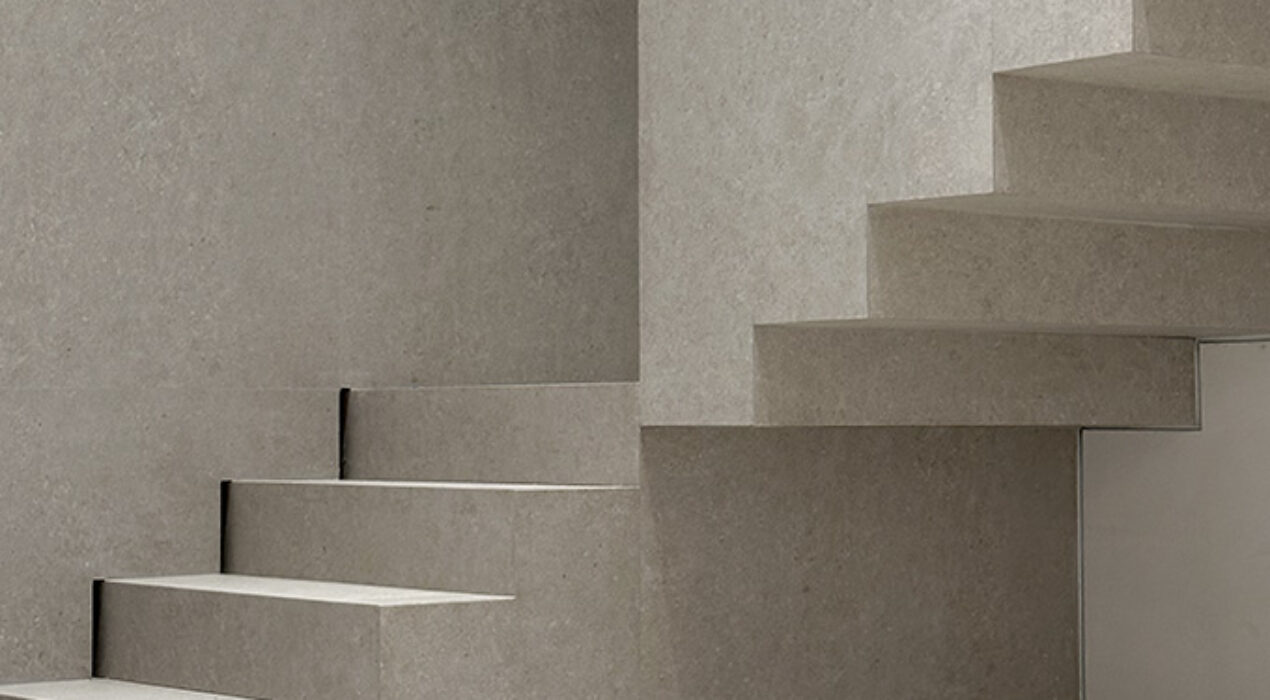
RG House is a residential interior design project located in Madrid. It is an isolated single-family home on 2 floors in which comfort and light are of utmost importance.The light and uniformity of the materials guide the design and details, forming a place with Mediterranean roots and an architectural approach that prioritizes simplicity and essence over the superfluous.ProductionPriority is given to attention to detail, the encounters between materials and a luxurious simplicity that is born from the nobility of the materials: bleached oak, aged brass and large-format rectified porcelain. client: RG category: Residential
Read More ›
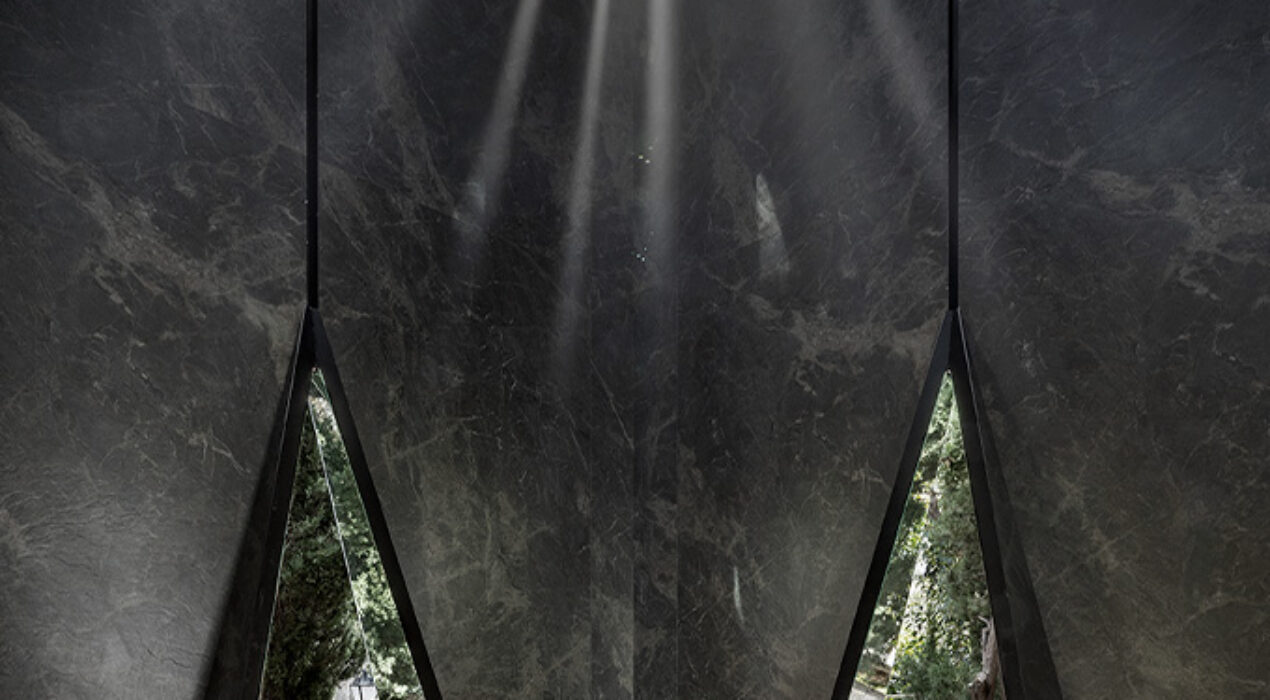
SMMS® designs an inspiring space for Neolith in which its product blends with the environment, creating an invisible forest of veins, in which light and water evoke the passage of time. An ode to nature as a permanent source of inspiration, reinforcing the commitment and respect that the brand maintains for the environment. client: Neolithcategory: Exhibitionawarded project: Casadecor 2024 First Mention
Read More ›
From the tireless search for beauty in its purest form, a unique way of understanding ceramics is born through a new brand, Clara Ceramics, based on different associated concepts that marks us, Clara Ceramics, based on different associated concepts that marks us. They will serve to found its values, such as: transparency, clarity, purity and honesty. Inspired by the elegance and sumptuousness of transparency, Clara Ceramics isa true demonstration of simplicity, minimalism, quality and honesty. A brand that stands on very solid foundations that support it, leavingglimpse their professionalism and kindness in every detail.With a clear, elegant and purely timeless product. Its essence is based on the incessant search for natural perfection. The place where light meets form and ceramic inspires a promise of incomparable timelessness that dazzles the world.A brand that was born supporting a pure, almost material product without “hidden vices”, where each piece is forged under the conviction of providing clarity, purity and personality to each space. Dressing and transforming environments into true corners with soul.Where honesty reaches every corner and every space. A brand that also speaks of success in professional relationships, where respect, clarity andcommercial transparency highlights highly professional human treatmentand honest, with the aim […]
Read More ›
The Inspirational Booth. The Inspirational Book. We propose an immersive journey through the catalogue. An immersive journey to the place where ideas take shape to later become architecture. A sensory joy to creativity. A change in “character” capable of causing a change in scale. client: Wow Designcategory: Ephemeral
Read More ›
Unique visual and tactile experience that highlights the beauty and versatility of natural stone and ceramics. Neutral tones create an elegant and sober atmosphere, allowing the products on display to be the protagonists. The entrance to the stand is spacious and welcoming, with an arch of stone that gives a feeling of robustness and permanence. client: Perondacategory: Ephemeralawarded project: Coverings Best in Show 2024
Read More ›
The Skin, as a Living Organ, has a natural power, an innate technology that gives it special abilities to self-regulate and protect itself. Inspired by that natural power that characterizes it, a living testimony of the deep connection between man and nature, we created the new graphic concept for the Mamen Molina brand. A concept that draws from the natural power of the dermis and its constant dialogue with science.In this way, we manage to visually align the brand with its purpose: to promote a beauty that goes beyond the superficial, a beauty that is nourished by the innate wisdom of nature, a beauty that emanates from the inside out. Well-cared for skin adapts to the passage of time and provides sustainable longevity. Inspired by skin client: Mamen Molina category: Branding identity
Read More ›
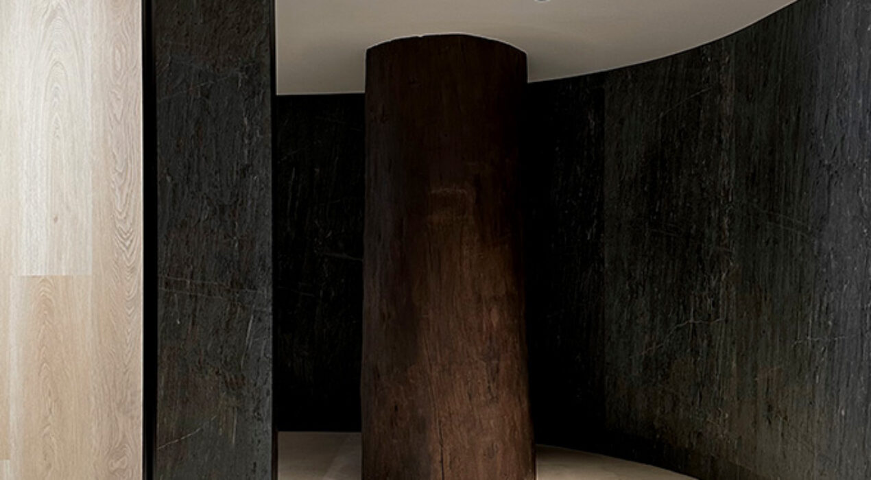
Atrium, an inspiring design full of symbolism, capable of connecting with the spirit of the firm and its roots, enhancing its values as distinctive brand features. A unique and singular space that highlights nature as a source of inspiration.SolutionThe spatial concept is inspired by the deep connection of nature with architecture, from which an atmosphere of serenity and balance has been created, capable of uniquely displaying the firm's range of materialities.ProductionSinuous walls of sheets of stone curved like tongues of lava give way to the central atrium and its large slats covered with wood, sheets of water and a suspended ceiling of paper and stained wood. client: L' Antic Colonialcategory: Showroom
Read More ›
Four entrepreneurial soulsgave life to CEVICA in Castellón de la Plana, and its history has been marked by an authentic symphony of passion, effortand dedication to ceramics.An entire family history woven with threads of tradition and linked to a powerful vision of the future that continues today at the hands of the second generation. An inexorable connection between past and future, experience and avant-garde, tradition and modernity. Each and every piece produced at Cevica is created from a personalized approach according to the needs of our clients. A unique artistic expression,fruit of the work and dedication of the entire team.In each of the production processes, maximum care is taken of all the details that, accompanied by the latest ceramic decoration techniques on the market, seek to achieve total personalization and materialization of the dreams of all its clients. Because design is dialogue. We believe in listening as a true catalyst for the entire creative and productive process. Where each ceramic piece is capable of telling a truly unique and exciting story. A key witness of the commitment to honesty, quality and service to each and every one of its clients.A story of union between artisanal tradition and innovation,to result in […]
Read More ›
Synchrony is an architectural concept inspired by balance, capable of harmonizing the material diversity of Roca through a space of ethereal and minimalist ephemeral architecture, in which light and warmth come together to create an atmosphere of spatial comfort that renounces to the superfluous, showing the essential.Transversality and material connectivity. Synchrony is capable of conceptualizing and hierarchizing theproduct combination, based on aesthetic balance and functionality, through transversality between collections. Providing them with capillarity and therefore greater depth, so that they can coexist synchronized in the same space, providing harmony and homogeneity client: Roca Tilecategory: Ephemeral Architectureawarded project: Cevisama Second Best in Show 2024
Read More ›
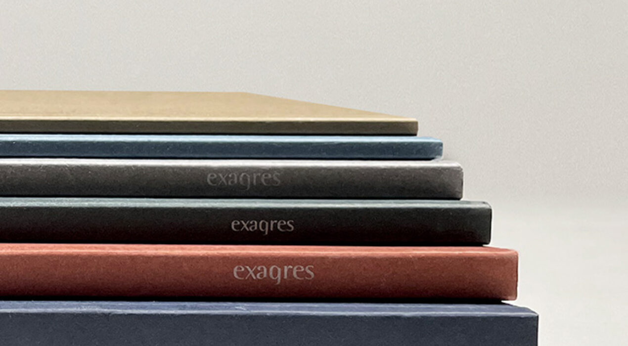
The objective of the proposal is to present to Exagres the new graphic linefor the brand's catalog collection.The graphic concept revolves around the creation of a style proposal: solid, sober,elegant and timeless. Which will guarantee that the design style lasts in the future.time more easily.A proposal that advocates the use of gradient colors, to provide graphic continuityto the “encyclopedia”, and with a range of colors reminiscent of the environment, within order to emphasize the connection with the authentic, with the natural. All this without leaving aside the language and technical details, which are emblematic ofbrand and differentiating detail. To do this, on the covers, and through cardboard.specials, we will work on the concept of touch and textures, language linked to the worldof ceramics, introducing graphic techniques and special finishes to provide theproposal of greater singularity, within a homogeneous and elegant framework. Internally we seek an evolution in the way of presenting and displaying information. we chasegreater visual impact, therefore we will go to large format “full” images to get more performancevisual to infographics. The textual content will be represented in a more technical way, with pages ofgeneral breakdown, not by color. The pace of reading the catalog is very important […]
Read More ›
This mode enables people with epilepsy to use the website safely by eliminating the risk of seizures that result from flashing or blinking animations and risky color combinations.
Visually Impaired Mode
Improves website's visuals
This mode adjusts the website for the convenience of users with visual impairments such as Degrading Eyesight, Tunnel Vision, Cataract, Glaucoma, and others.
Cognitive Disability Mode
Helps to focus on specific content
This mode provides different assistive options to help users with cognitive impairments such as Dyslexia, Autism, CVA, and others, to focus on the essential elements of the website more easily.
ADHD Friendly Mode
Reduces distractions and improve focus
This mode helps users with ADHD and Neurodevelopmental disorders to read, browse, and focus on the main website elements more easily while significantly reducing distractions.
Blindness Mode
Allows using the site with your screen-reader
This mode configures the website to be compatible with screen-readers such as JAWS, NVDA, VoiceOver, and TalkBack. A screen-reader is software for blind users that is installed on a computer and smartphone, and websites must be compatible with it.
Online Dictionary
Readable Experience
Content Scaling
Default
Text Magnifier
Readable Font
Dyslexia Friendly
Highlight Titles
Highlight Links
Font Sizing
Default
Line Height
Default
Letter Spacing
Default
Left Aligned
Center Aligned
Right Aligned
Visually Pleasing Experience
Dark Contrast
Light Contrast
Monochrome
High Contrast
High Saturation
Low Saturation
Adjust Text Colors
Adjust Title Colors
Adjust Background Colors
Easy Orientation
Mute Sounds
Hide Images
Virtual Keyboard
Reading Guide
Stop Animations
Reading Mask
Highlight Hover
Highlight Focus
Big Dark Cursor
Big Light Cursor
Navigation Keys
DECLARACIÓN DE ACCESIBILIDAD
SUMMUMSTUDIO se ha comprometido a hacer accesibles sus sitios web de conformidad con el Real Decreto 1112/2018, de 7 de septiembre, sobre accesibilidad de los sitios web y aplicaciones para dispositivos móviles del sector público (en adelante, Real Decreto 1112/2018, de 7 de septiembre).
La presente declaración de accesibilidad se aplica al sitio web https://www.summumstudio.es
SITUACIÓN DE CUMPLIMIENTO
Este sitio web es parcialmente conforme con el Real Decreto 1112/2018, de 7 de septiembre, debido a la falta de conformidad de los aspectos que se indican a continuación.
CONTENIDO NO ACCESIBLE
El contenido que se recoge a continuación no es accesible por lo siguiente:
Falta de conformidad con el Real Decreto 1112/2018, de 7 de septiembre: podrían existir fallos puntuales de edición en alguna página web, tanto en contenidos HTML como en documentos finales, publicados en fecha posterior al 20 de septiembre de 2018 (fecha de entrada en vigor del Real Decreto 1112/2018, de 7 de septiembre).
Carga desproporcionada: no aplica.
PREPARACIÓN DE LA PRESENTE DECLARACIÓN DE ACCESIBILIDAD
La presente declaración fue preparada el 25 de abril de 2023.
El método empleado para preparar la declaración ha sido una autoevaluación llevada a cabo por el propio organismo.
OBSERVACIONES Y DATOS DE CONTACTO
Puede realizar comunicaciones sobre requisitos de accesibilidad (artículo 10.2.a) del Real Decreto 1112/2018, de 7 de septiembre) como, por ejemplo:
Informar sobre cualquier posible incumplimiento por parte de este sitio web. Transmitir otras dificultades de acceso al contenido. Formular cualquier otra consulta o sugerencia de mejora relativa a la accesibilidad del sitio web.
A través de este procedimiento podrá iniciar una reclamación para conocer y oponerse a los motivos de la desestimación de una solicitud de información accesible o queja, instar la adopción de las medidas oportunas en el caso de no estar de acuerdo con la decisión adoptada, o exponer las razones por las que se considera que la respuesta no cumple con los requisitos exigidos.
CONTENIDO OPCIONAL
La versión actualmente visible de este sitio web es de febrero de 2023 y en esa fecha se hizo la revisión del nivel de accesibilidad vigente en aquel momento. Entre otras se adoptan las siguientes medidas para facilitar la accesibilidad:
Utilización de texto alternativo en las imágenes. Los enlaces ofrecen detalles de la función o destino del hipervínculo. Uso de los estándares del W3C: XHTML 1.0, CSS 3.0, WAI AA.
Puede consultar en la página de Aviso Legal para qué navegadores y versiones está optimizado este sitio web.